
The feedback your photos deserve
Upload any photo. Get an honest score across 6 dimensions — and the one change that will most improve your next shot.
We keep a small thumbnail so you can review your history. Your original photo is never stored. Privacy policy
Free account: 3 critiques a month. No card needed.
What a critique looks like
Three example photos, scored the way Second Eye scores yours.

Your eye goes to the white heart in the foam, then slides down to the bright glare on the saucer and the spoon.
- Composition & framing4
- Light & exposure4
- Sharpness & technique6
- Colour & processing5
- Storytelling & emotion3
- Originality & creativity3
Read the full critique
What works
- The heart is crisp and centred in the cup, so the one thing worth looking at is in focus.
- The deep green ceramic against the warm tan foam gives a natural, pleasing colour contrast.
- Soft window light keeps the texture of the foam and its tiny bubbles visible without burning out the white.
What to improve
- The camera sits at an in-between angle — neither straight down nor at table level — so the cup looks slightly distorted and the saucer runs off three edges of the frame.
- Window reflections leave bright hotspots on the saucer and a harsh streak down the spoon, pulling the eye away from the heart.
- Nothing tells us where or when: no hands, no table setting, no café around it, so it reads as a record of a coffee rather than a moment.
One thing to try
Next coffee, shoot it twice: once straight down from directly above, with the whole saucer and a little table around it, and once at table level with the café blurred behind. Turn the saucer until the reflections slide off it, and wipe the rim first. Success looks like this: one frame where the heart sits in clean space with nothing bright competing, and the setting tells us something about the place.
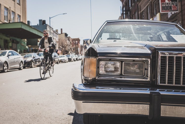
Your eye lands on the chrome grille and headlights, then jumps left to the cyclist heading towards you.
- Composition & framing7
- Light & exposure6
- Sharpness & technique7
- Colour & processing7
- Storytelling & emotion6
- Originality & creativity7
Read the full critique
What works
- Clear layering: the car's front end anchors the right, the cyclist fills the left, and the receding street adds depth.
- Cropping the car hard at the frame edge feels deliberate — its headlights and grille read almost like a face.
- The warm, slightly faded grade suits the era of the car and holds the scene together.
What to improve
- Hard midday sun throws glare across the windscreen and bonnet, and blocky shadows under the car and the cyclist.
- The cyclist is small, eyes hidden behind sunglasses, and not reacting to anything, so the two halves of the story sit side by side instead of talking to each other.
- The red sign in the top-right corner pulls the eye out of the frame, and the building on the left leans outward.
One thing to try
Pick one strong static anchor on a busy street — a classic car, a doorway, a mural — and stay with it for 20 minutes in the last hour before sunset. Pre-focus where people will pass and wait for someone whose look, gesture or colour echoes the anchor. Check the corners are clean before you press the shutter. Success looks like this: the passer-by and the anchor read as one idea, not two subjects that happen to share a frame.
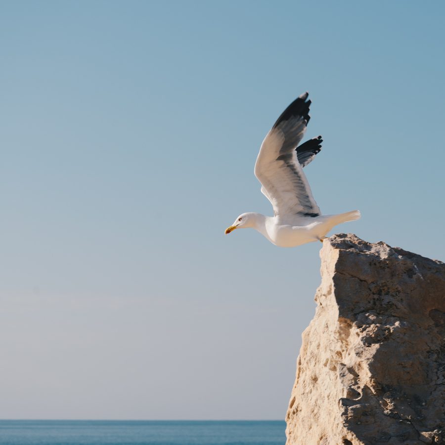
Your eye goes straight to the gull's head and yellow bill — the brightest, sharpest point, aimed into open sky.
- Composition & framing8
- Light & exposure8
- Sharpness & technique8
- Colour & processing7
- Storytelling & emotion8
- Originality & creativity7
Read the full critique
What works
- Timing: wings at full lift while one foot still grips the edge — this is the instant of departure, not a bird already flying.
- Lead room: the gull faces a wide band of clean sky, so the frame gives it somewhere to go.
- Low, warm side light models the white plumage without blowing it out and brings out the texture of the rock.
What to improve
- The rock fills almost a third of the frame, and its warm, detailed texture competes with the bird for attention.
- The soft, lifted grade leaves a white bird against a pale sky with little contrast, so the subject doesn't separate as crisply as it could.
- The sea is squeezed into a thin strip on the bottom edge. Either give it room as a layer or leave it out.
One thing to try
Next time you find a perch like this, drop your angle and step back so the rock becomes a smaller, darker wedge in one corner and the horizon sits nearer the lower third. In the edit, add contrast to the bird only. Success looks like this: the gull is instantly the brightest, crispest thing in the frame, and the rock reads as a launchpad rather than a second subject.
An honest score for every photo
Second Eye is a free AI photography critique tool. Upload any photo — portrait, street, landscape, wildlife, architecture, macro or product — and get an overall score out of 10 plus six dimension scores: composition & framing, light & exposure, sharpness & technique, colour & processing, storytelling & emotion, and originality. Every critique ends with one concrete change to try on your next shot.
How does Second Eye score my photo?
It evaluates your photo across six dimensions — composition, light, sharpness, colour, storytelling and originality — and returns an overall score out of 10 with specific, honest feedback. The scoring criteria adapt to the genre you select.
Is Second Eye free?
Yes. Create a free account and get 3 full AI critiques and scores every month. No card needed.
What feedback do I get with my score?
An overall score and per-dimension scores, what works in the image, what to improve, and one concrete change to try next — the candid feedback friends and likes never give you.